

The starting point for this page is the Make Your Own Tax Plan page from TaxJusticeNow, the Web site created by U-C Berkeley economics professors Emmanuel Saez and Gabriel Zucman to demystify and popularize the ideas in their 2019 book, The Triumph of Injustice: How the Rich Dodge Taxes and How to Make Them Pay (available via this link to the publisher, if you’d like to bypass Amazon).
The graph from that page shown below breaks down current U.S. tax incidence by income groups for 8 tax types (income, payroll, etc.). Actually, 10 tax categories are shown, since private health insurance is included as an extra tax, as is a new, null tax category, “National Income,” whose meaning isn’t clear at present. (We also apologize for the hard-to-read graph quality.)
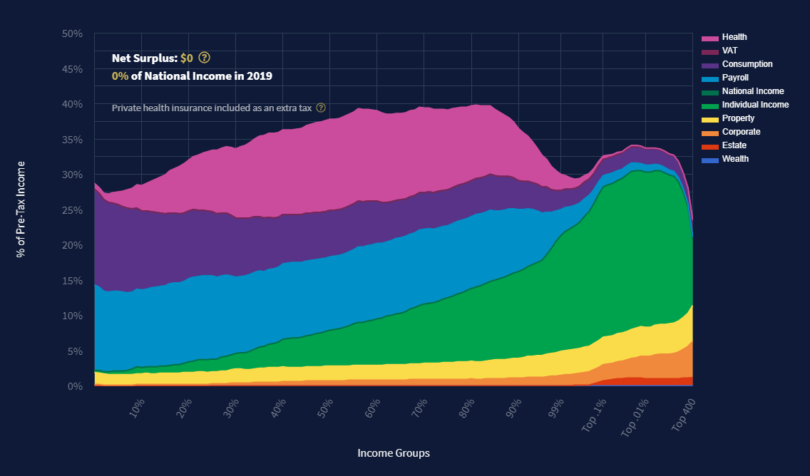
Current (2018-2019) U.S. Tax System, by income group and tax type. Source: www.taxjusticenow.org
Importantly, rather than the usual 10 income deciles, the TaxJusticeNow charts use 13 groups, since they break down the top 1% of households into four successively wealthier categories: the top 1% (which Saez and Zucman call the 99%, as in percentile), the top 0.1%, the top 0.01%, and the top 400 families.
The significance lies in both the extraordinarily outsize wealth of the increasingly wealthy strata and their ability to shield their income from taxation. Thus, whereas the top 0.1% and 0.01% groups — literally, the wealthiest one in a thousand and one in ten thousand families — currently pay 30-35 percent of their income in taxes, the top 400, who, we could say, punch 10,000 times above their weight (since they make up only 0.0003% of households but hold 3 percent of U.S. wealth), pay a tax rate of just 23 percent, on average.
The baseline graph above depicts current (2018-2019) U.S. taxation. The TaxJusticeNow site outputs analogous graphs for the Warren and Sanders tax plans (which Profs. Saez and Zucman helped craft), for a “Triumph of Injustice’s Tax Plan” that presumably captures the professors’ preferences, and for tax plans of the user’s own devise.
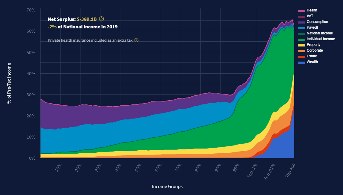
U.S. tax breakdown under Sen. Warren’s plan, per Saez & Zucman at taxjusticenow.org.
The next graph is the Saez-Zucman break down for Sen. Warren’s plan. The wealth tax, depicted in deep blue in the graph’s lower right, kicks in only for the top 0.1% of families. The Health Insurance “tax” is the vanishingly thin pink band at the top, reflecting Warren’s intent to pay for universal health coverage almost entirely by raising wealth and other taxes on the super-rich.
White House Says the Richest Pay Only 8% in Federal Taxes
That section head is the headline of the Sept 24, 2021 print version of a New York Times story posted on Sept 23, In Push to Tax the Rich, White House Spotlights Billionaires’ Tax Rates.
The story, subtitled “A White House analysis using an unconventional methodology says the wealthiest Americans pay far less in taxes than others,” reported on a new paper by senior administration economists Greg Leiserson of the President’s Council on Economic Advisers and Danny Yagan of the Office of Management and Budget that employed a more comprehensive methodology to measuring income.
The Times story, by Jim Tankersley, reported:
The analysis suggests that the wealthiest 400 households in America — those with net worth ranging between $2.1 billion and $160 billion — pay an effective federal income tax rate of just over 8 percent per year on average. The White House is basing that tax rate on calculations using data on high earners’ income, wealth and taxes paid from the Internal Revenue Service and the Federal Reserve’s Survey of Consumer Finances.
The White House’s calculation of what the wealthiest pay in taxes is well below what other analyses have found. The difference comes from the White House officials’ decision to count the rising value of wealthy Americans’ stock portfolios — which is not taxed on an annual basis — as income. It finds that between 2010 and 2018, those top 400 households, when including the rising value of their wealth, earned a combined $1.8 trillion and paid an estimated $149 billion in federal individual income taxes.
Tax Justice Initiative
In early 2024 the New York Times reported on organizing by the recently formed Tax Justice Initiative to win state-level wealth taxation in California, New York, Washington and other states, “mirroring the federal wealth tax proposed by Sen. Elizabeth Warren of Massachusetts during her 2020 presidential campaign.”
The Times story, Vermont Is Latest State to propose New Taxes For Wealthiest People (Jan. 23, 2024), noted the organizers’ hopes that “frustration over the escalating cost of living and resentment over the many breaks afforded to the ultrawealthy will coalesce into a political groundswell.”
While the story didn’t shy from the difficulties — political, cultural and perhaps constitutional — its links to and brief accounts of proposed legislation in Vermont and other states make it a useful summation of efforts to advance wealth taxation in the United States.
“The package of bills,” writes reporter David W. Chen, “is part of a broader push across the country by progressive groups who hope that the political moment has arrived to shake up the tax system to address income inequality.”